Behind the Scenes: Why We Gave Our Homepage a Makeover (and How It’s Helping)
At Patriot Prayer Tees, we care deeply about the message behind our shirts. But just as important as the designs themselves is how people find and experience our website. So this June, we took a deep dive into our homepage and gave it a thoughtful refresh. Here’s what we changed, why we did it, and how it’s helping visitors get connected to our mission more easily. These changes were researched using our now paid version of ChatGPT.
1. Removed the Featured Product
Why?
We noticed that showing a single featured product at the top of the homepage was distracting and didn’t give visitors a sense of what the whole site was about. It made the homepage feel like a product page instead of a welcoming intro.
The Fix: We removed the featured product and replaced it with a clean, bold headline and mission-based intro. This immediately tells visitors what we’re about.
2. Added a Clear Hero Headline
“Faith-Fueled Shirts That Speak Bold Truth” now leads the page.
Why?
We wanted something that reflects our core identity and draws in like-minded believers. The subtext reinforces our mission: helping people share Gospel truth with conviction.
The Impact: Visitors now get clarity within seconds—no guessing what we sell or why.
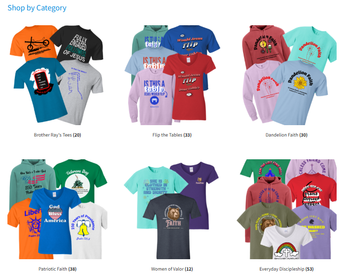
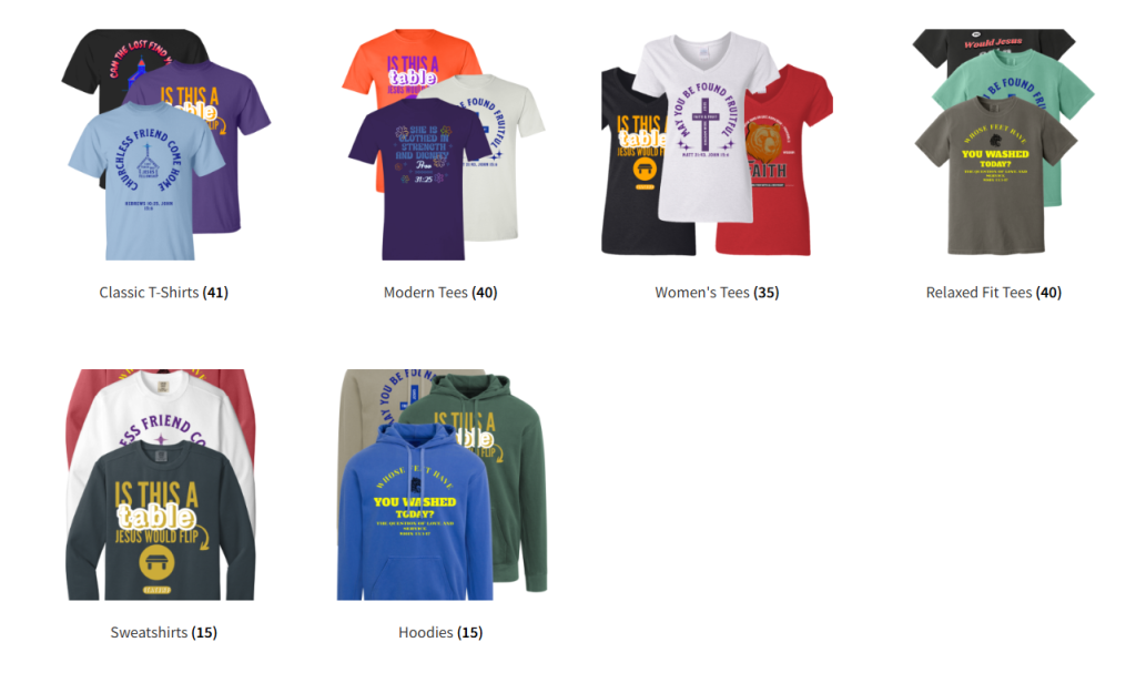
3. Improved Category Layout with Real Product Images
Why?
We used to only have some general navigation. Now, we’re showing actual shirt images grouped by message type—like “Gospel Message Shirts,” “Conversation Starters,” and “Patriotic + Scripture.”
The Fix: Big, clickable visual tiles make it easier (and more fun) to shop by theme.
The Result: Site visitors don’t get lost; they go directly to the content that fits their interest.
4. Simplified the Banner Text and Changed the Background
Why?
Originally, we had a long purple banner with too much text and hard contrast. It looked intense and was hard to scan.
The Fix: We shortened the text, made the background a softer gray, and bolded one key line: “Wear the Gospel. Flip the Norm.”
The Outcome: Cleaner, clearer messaging that doesn’t overwhelm the visitor.
5. Replaced a Repetitive Image with Our Logo
Why?
One of our category tiles used to have a cluttered collage of shirts that repeated other images on the page.
The Fix: We swapped in our logo, giving visual breathing room to the layout.
The Benefit: The page feels more organized and less visually chaotic.
6. Added One Strong Testimonial
Why?
People trust real reviews. Even one honest review builds credibility.
The Fix: We highlighted a satisfied customer who liked both the shirt and the print quality.
What’s Next: As we gather more reviews, we’ll add them to build that trust further.
7. Streamlined the Blog Links
Why?
We had long purple buttons stacked up with a lot of copy. It was overwhelming.
The Fix: We condensed the text, renamed the buttons, and cleaned up spacing.
The Result: Easier to browse. Visitors now see a clear path to learn about our materials, mission, and design process.
8. Final Touches: Mission & Footer Clarity
We tightened up our footer to better explain what “Patriot,” “Prayer,” and “Tees” mean in our name—and we made sure the contact info, hours, and social links were all working and easy to find.
The Big Picture
Every change we made was focused on a single goal: make it easier for people to connect with our mission and find the shirt that helps them share their faith boldly. If you’ve visited before and bounced, we invite you to take another look.
Thanks for growing with us—and for wearing your faith out loud.
Update from 6/28/2025:
We did even more!
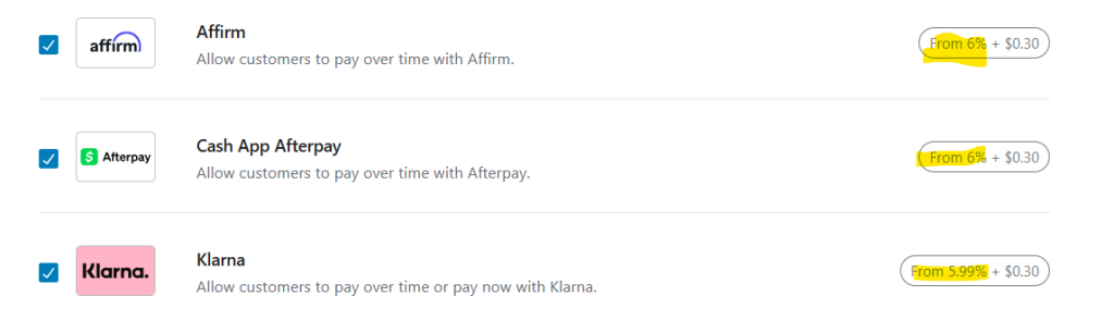
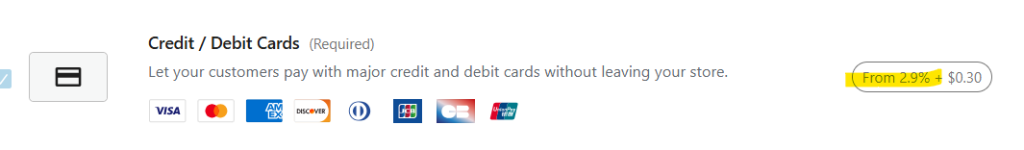
In short: New logo, larger text/font, pictures of real people wearing the shirts on homepage, added starting prices to the category descriptions to show a price on homepage, added payment icons, added My Account menu across the top, centered all the text, replaced grey font color with default color. This change suggestions came from Grok AI review of the site.