Posted on

Major Weekend Update: Thousands of Prices Adjusted

More weekend work! I’ve changed the prices on everything.

(These are notes I scheduled to post on Monday.)

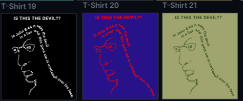
That’s about 6,000 unique combinations of design, shirt style, color, and size — each with its own individual price.

I used the export/import feature on my products page to update everything, but I had to do it in small batches. If I tried too many at once, the system would freeze. So I tackled all the classic tees first, then the modern tees, and so on. It was time-consuming, and after each batch I had to manually check the listings. Most prices updated correctly, but a few didn’t because the import process would stall or hang.

This was a deep dive into my current costs and expenses. These new, lower prices are tight — there’s no room for advertising, paid website upgrades, or future features. But I did leave space for bulk discounts for orders of 20+ shirts, which I’ll be working on next.

While every price changed, many were small adjustments (about 1–2%). But others were much more dramatic. For example, the classic tee dropped from $22.85 to $16.97 — a 25% price cut! That’s all based on the actual printed shirt cost from my print-on-demand supplier. Some styles and colors just cost a lot more than others and thus their prices didn’t change dramatically.

Time will tell if this was the right move — and if I can afford to keep prices this low.

PPT

Posted on

Weekend Website/Shirt Work

  1. Added new blog category “Design Stories” to separate out the design posts from business/website posts.
  2. Went through the blog posts and added small updates on items.
  3. Made updates to list Ray’s 5th shirt.
  4. Schedule posts for Ray’s 5th shirt.
  5. Selected about 6 shirts to promote every month. Scheduled those posts until Dec of 2026.
  6. Scheduled posts for the rest of the month of June. 1 post a day. I will post more when I have time, but this keeps the accounts fairly active.
  7. Created a survey to get customer feedback on the new few shirts.
    • Update: The survey received zero responses. I reposted it about 3 times.

Posted on

Business Check-In

Business review time. Rose-Thorn-Bud time. Not sure who came up with it, but the rose are things going well. The thorn are things going poorly. The bud are things that could be good in the future with some effort and time.

Roses

  1. The website is working well, meaning the products are listed, the checkout works, & the shirts are shipped.
    • Many of the free shirt offers were processed through the website.
  2. The shirts are good quality. About 20 shirts made and shipped. One had a slight defect, very slight, and CustomCat replaced it immediately.
  3. The website has been getting traffic! It is much more than I expected, around 450 page views for last 30 days, less unique visitors of course.
  4. As a Christian business, I recognize there’s a higher mission at work. God’s purpose doesn’t depend on whether I sell shirts or not. The goal of this business is simply to help believers share the Gospel through eye-catching designs. I also understand that these shirts aren’t for everyone—there are many ways to share the Good News, and this is just one of them.
  5. Followers are growing across the social accounts. However, it’s more of a one-on-one connection. I read their content and make comments, they do the same for mine, we find we having something in common, etc. How will that keep working if I get to 300 followers or more?

Thorns

  1. Removing free shirt giveaways & removing purchases made by me – there’s only been 1 real sale.
  2. Seems to be some people that don’t believe I’m really giving away free shirts when I post about it. I don’t get it.
  3. Trial periods are ending on some apps I’m using, so monthly costs will go up.
  4. It takes a lot of time to keep posting across the social media sites, even using Zoho Social and JetPack.
  5. I’ve mentioned before, but now with about 190 separate products (each having many size and color variations), I’m wondering if I’m growing out of my own WordPress site.

Buds

  1. I should spend more time on the Gallie-Life store. I step up the products and check daily for sales, but I need to look more into growing that store/area.
  2. Should I find a way to sell locally, in-person? There’s little festivals around. That would require buying the shirts ahead of time, keeping the stock around my house, getting a pop-up tent, tables, etc.
  3. Should I lower my prices? At mentioned, the website traffic is up, but still no sales. It’s something to consider. The prices seem to align with most other t-shirt sites I’ve found, unless they are having a close out sale. [Update: Prices Lowered.]
  4. Should I use AI to create the social media posts, re-write the website, etc.? There’s a lot of claims from companies wanting various ranges of fees their AI can do almost everything for you.
  5. Should I offer a bulk discount? With the print of demand service I selected, each shirt is printed for the specific order. I don’t receive any price breaks on order quantity, not until I’m selling enough it replaces my main household income. However, to help sales, if a customer ordered 20 or 25 shirts, should they get a discount to them? [Update: Bulk discounts offered to churches.]

Posted on

Brother Ray’s 4th shirt

The ideas keep flowing from Brother Ray! This graphic is from a business card he passed to people while ministering.

I wanted to keep this one as original as possible. I imported the image, removed the background & boarder. Then I used the Kittl app to covert it to a vector image. I deleted all the text and replaced with title text. I chose a font that resembled being hand lettered, as the bike seems to have taken that feel after being converted. Here’s the result.

I’ll send this over to him and see if he approves. If so, then we have 4 Brother Ray shirts! Thank you Brother Ray!

I’ll also send an alternate with the text more like stencils and less hand drawn.

After a a while, I heard back from Ray and he likes the slight changes, where the letters are less hand drawn looking.

Time to create the shirt listings with CustomCat and move them over to the website!

PPT

Posted on

Brother Ray’s 3rd Shirt

This one is a much shorter story than the last shirt. Only one post.

Brother Ray sent me this image of a shirt he had made many years ago.

Being three lines of text and two fonts and two colors, these are the variations I sent Brother Ray to review.

Basically the same design:

However, I added some variations. Here’s the first variation. I might have gone too far on this one. I angled all the text. Then I made the 1st two lines color cut (two tone) and I duplicated the 3rd line, changed the color, and put the duplication behind the original. Brother Ray didn’t like this.

The next variation removed some of those changes. I removed the two tones and duplicate background on the 3rd line. However, I kept the angle. He still wasn’t a fan.

Then I tried this approach. Like a pyramid. Brother Ray said we were getting better now. However, he wanted to add a 4th line, “of JESUS .”

Since I had the designs saved, I added “of Jesus” to all of them and sent one more time for a side by side vote.

He picked the one on the far left. However, I wasn’t finished. It might be hard to tell, but I took apart the image and created a pyramid to align the text to. Then once the text was completely aligned, I deleted the pyramid shape behind the text for this final product.

On this design, we’re not going to change the colors. It should look good on dark shirts, but not on light shirts.

I’ll start loading this one into the store now. That’s all for Brother Ray’s shirt #3.

Posted on

Brother Ray’s 2nd shirt – part 3

In parts 1 and 2, we ironed out (please don’t iron our shirts, btw) the optical illusion part of the shirt. Now for the shirt message.

Staying close to Brother Ray’s image of his design we have option 1:

I get the general idea, as you read the 3rd line, you start to turn your head and possibly see the face spells ‘Liar’. But, I wanted to give Brother ray some more options, so I proposed these three additional options:

Each has you turning your head a bit to read them, so the effect is the same as the original. After seeing them all, Brother Ray decided on the 1st alternate option, where the words sort of form the person’s back. It adds to the face illusion.

Now we’re down to color choices. The original shirt was all black text on a grey shirt. We agreed keeping all the text the same color was best. However, We expanded the color choices a wee bit. Here’s a start of the color choices for the text on some representative backgrounds. However, each will be placed on the t-shirt color that works best with that text color.

The next step is to create the shirts, but that will have to wait for another day.

All shirt listing will have “Artwork inspired by “Liar Face” illusion by Paul Agule.”

Posted on

Brother Ray’s 2nd shirt – part 2

With the image direction squared away there were still design considerations to make.

What does the replacement ‘liar face’ look like? What would a derivative or inspired by work look like?

Here are some that we considered. I would create them, share with Brother Ray and others for input, consider all the feedback, revise the design, and repeat. To date, this shirt design has seen the most revisions and collaboration. We really burned the midnight oil and racked up many texts and messages.

Honorable mention; use the word “thief”. It might have worked given enough trial and error. But at the onset, it doesn’t look like a face.

Next up, the word “lies” instead of “liar”. This one seemed like it was getting close, depending on the font used.

I certainly see a creepy face in this, but we didn’t like the “i”, not exactly part of the nose.

Then we tried “lies” again with more of a like shaking hand writing. It was manipulating each letter of the font to get this effect. This time we liked the nose area, but not the mouth or chin.

Then we took a completely different approach. What about using words to made up the lines of the letters, which also make up the face?

We tried the words from the Scripture referenced on Brother Ray’s shirt, which is John 8:44. This one had promise. From a distance, you still get the word “Liar” in cursive and a face. When you get closer you can see the word of the verse. It’s a solid runner up design.

We tried one more and this is the one Brother Ray liked the best. It’s not the words of the verse, rather it’s different types of sin – which almost all involve lies to others or to yourself. Additionally, the use of words not connected in a sentence allowed for variations in text size, direction, and distortions to really follow more of a cursive “Liar” from a distance.

Once again, this work is inspired by the classic, but it is certainly not the same work.