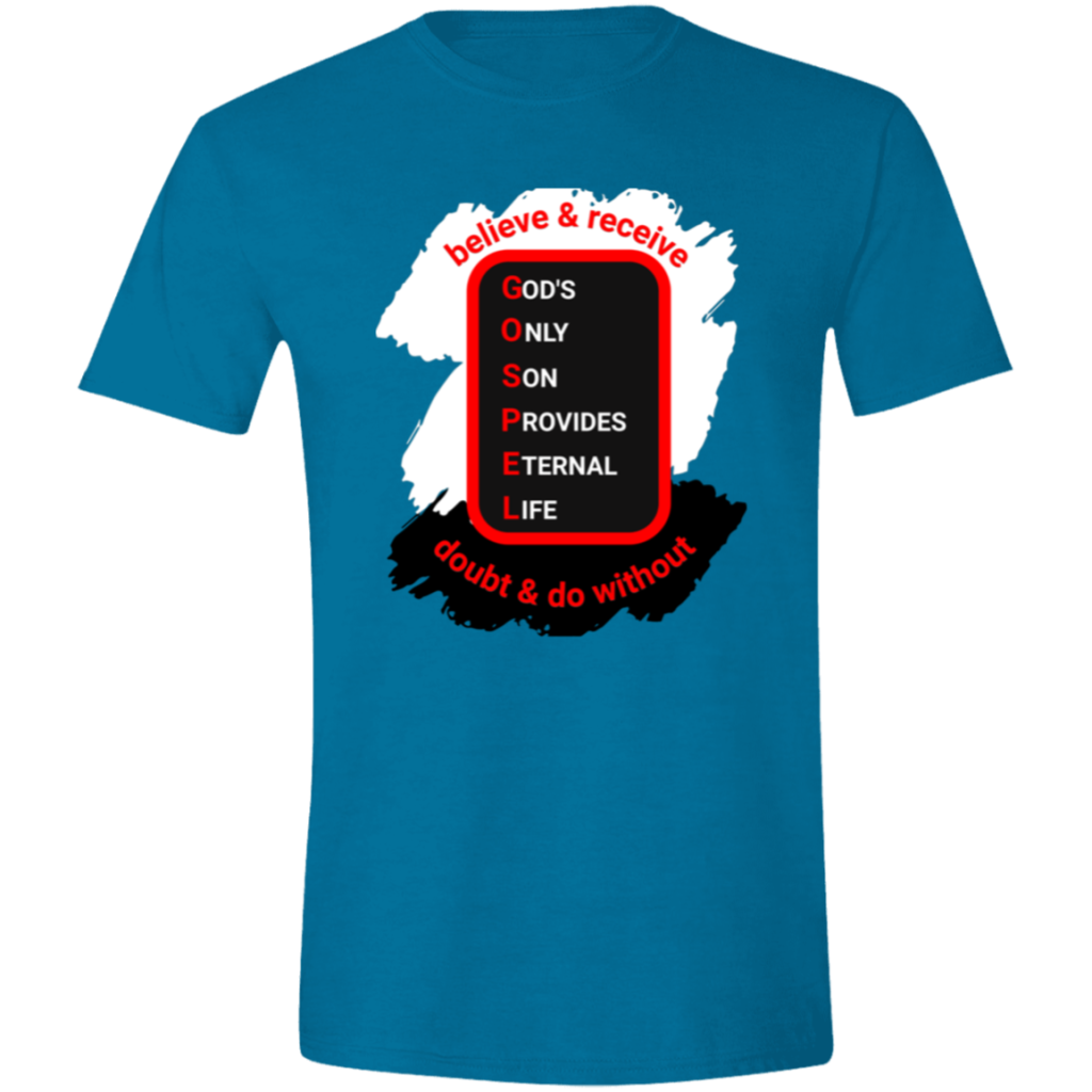

At the end of part 2 we had a sharp looking shirt, but I didn’t like the overall balance. Over the next couple of days I kicked around some designs. Two things I noticed while working on the overall layout was that GODS needed to the GOD’s and the lettering was not a match for the original patch.
In the original patch, the letters in GOSPEL are larger than the other letters.

But in the last design, all the letters were the same size.

So, it took a bit (ok a lot) in Kittl to get it looking good and lined up, but eventually I got it like this, which looks much closer to the original.

After several options for where to place the extra words Ray asked for I send this design to Ray:
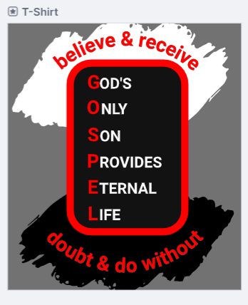
I like it, but I still felt it wasn’t as balanced as it could be. Maybe I’m not using the right word, but it still didn’t look complete yet.
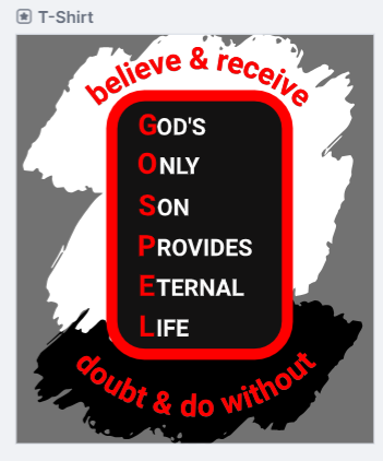
I duplicated the white patch, inverted it, and placed it behind the patch. That was it. That was the missing piece!
Ray said, “I love it & think it might make U good seller.”
I said, “it’s your design, I don’t want to sell it – that wasn’t the point” It was supposed to be more like a birthday present for him.
Ray said, “I want the message being seen. SELL it!”
That’s how we now have this design for sale in 4 types of shirts.
https://patriotprayertees.com/product-tag/gospel