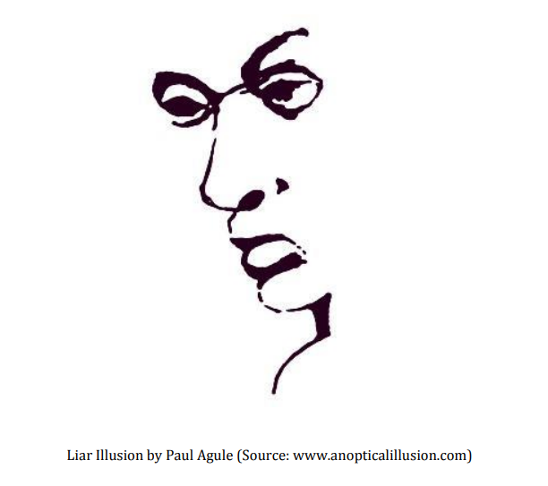
With the image direction squared away there were still design considerations to make.
What does the replacement ‘liar face’ look like? What would a derivative or inspired by work look like?
Here are some that we considered. I would create them, share with Brother Ray and others for input, consider all the feedback, revise the design, and repeat. To date, this shirt design has seen the most revisions and collaboration. We really burned the midnight oil and racked up many texts and messages.
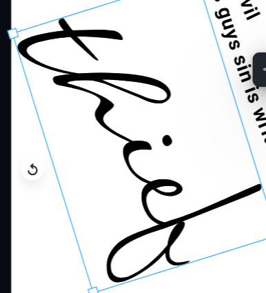
Honorable mention; use the word “thief”. It might have worked given enough trial and error. But at the onset, it doesn’t look like a face.
Next up, the word “lies” instead of “liar”. This one seemed like it was getting close, depending on the font used.
I certainly see a creepy face in this, but we didn’t like the “i”, not exactly part of the nose.
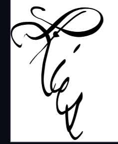
Then we tried “lies” again with more of a like shaking hand writing. It was manipulating each letter of the font to get this effect. This time we liked the nose area, but not the mouth or chin.

Then we took a completely different approach. What about using words to made up the lines of the letters, which also make up the face?
We tried the words from the Scripture referenced on Brother Ray’s shirt, which is John 8:44. This one had promise. From a distance, you still get the word “Liar” in cursive and a face. When you get closer you can see the word of the verse. It’s a solid runner up design.

We tried one more and this is the one Brother Ray liked the best. It’s not the words of the verse, rather it’s different types of sin – which almost all involve lies to others or to yourself. Additionally, the use of words not connected in a sentence allowed for variations in text size, direction, and distortions to really follow more of a cursive “Liar” from a distance.
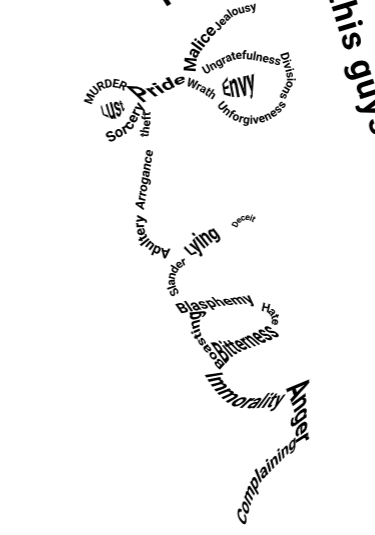
Once again, this work is inspired by the classic, but it is certainly not the same work.
