
This one is a much shorter story than the last shirt. Only one post.
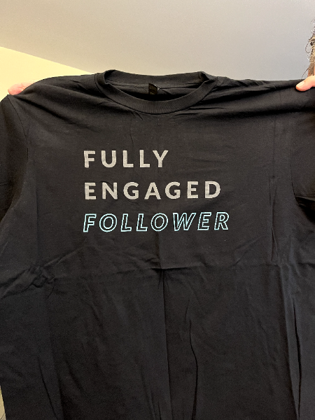
Brother Ray sent me this image of a shirt he had made many years ago.
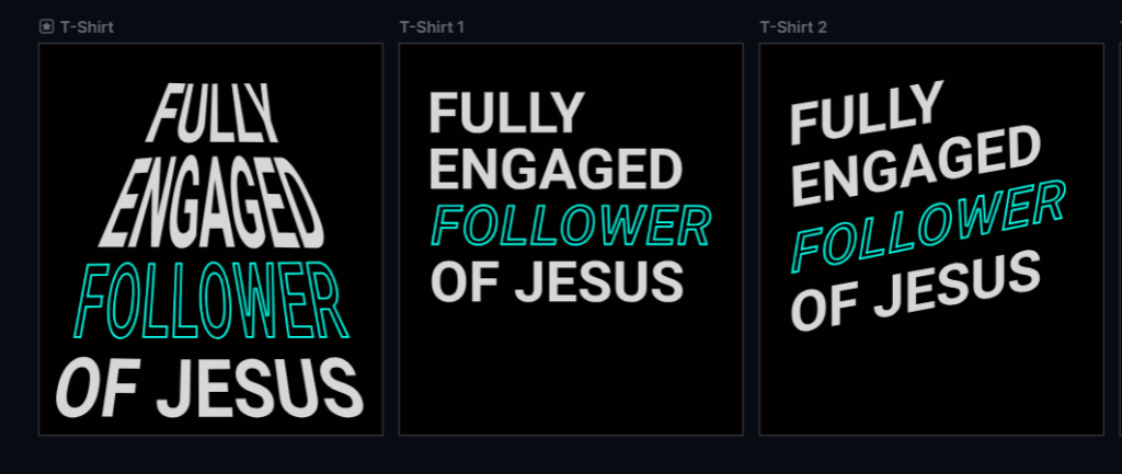
Being three lines of text and two fonts and two colors, these are the variations I sent Brother Ray to review.
Basically the same design:

However, I added some variations. Here’s the first variation. I might have gone too far on this one. I angled all the text. Then I made the 1st two lines color cut (two tone) and I duplicated the 3rd line, changed the color, and put the duplication behind the original. Brother Ray didn’t like this.
The next variation removed some of those changes. I removed the two tones and duplicate background on the 3rd line. However, I kept the angle. He still wasn’t a fan.

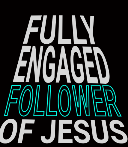
Then I tried this approach. Like a pyramid. Brother Ray said we were getting better now. However, he wanted to add a 4th line, “of JESUS .”
Since I had the designs saved, I added “of Jesus” to all of them and sent one more time for a side by side vote.
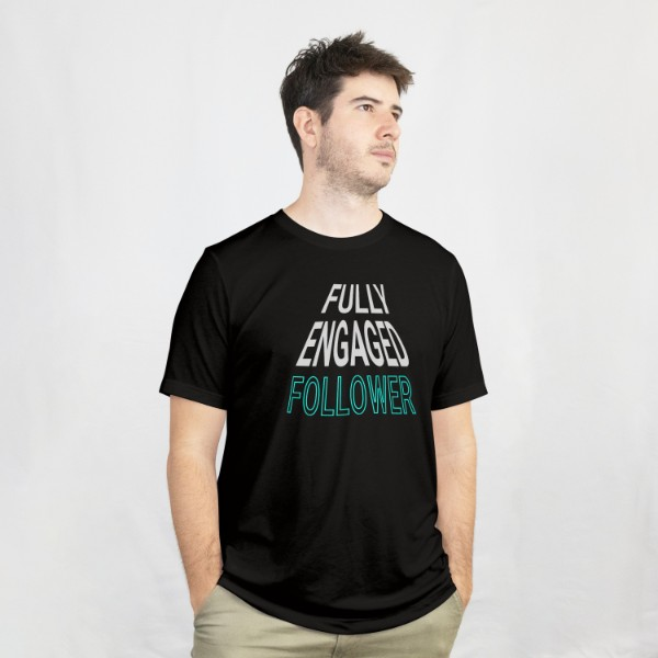
He picked the one on the far left. However, I wasn’t finished. It might be hard to tell, but I took apart the image and created a pyramid to align the text to. Then once the text was completely aligned, I deleted the pyramid shape behind the text for this final product.
On this design, we’re not going to change the colors. It should look good on dark shirts, but not on light shirts.
I’ll start loading this one into the store now. That’s all for Brother Ray’s shirt #3.