Posted on

Brother Ray’s 5th! Shirt

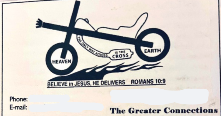
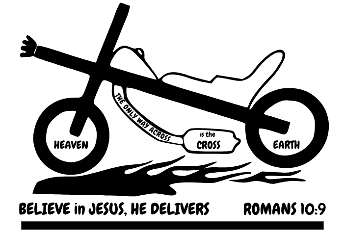
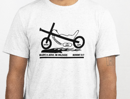
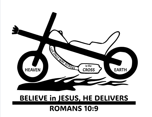
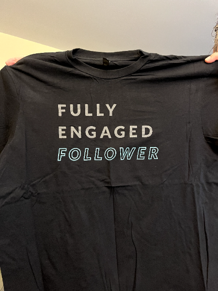
This is the story of Brother Ray’s 5th shirt and a review of multiple designs considered.

Brother Ray used this expression in his 30+ years of personal evangelism. He has used this to start conversations and teach people the Good News of Jesus Christ!
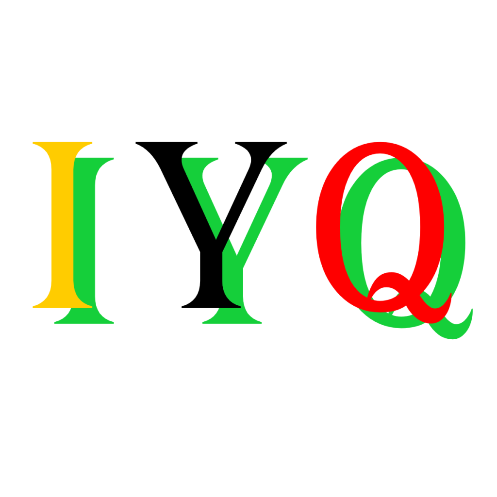
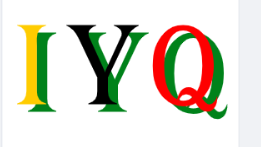
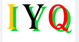
I Y Q

It is “I Y Q“. He’s used it on stickers, fabric patches, & t-shirts. Funny side story, his local t-shirt guy closed up a while back and he’d not found a replacement. I didn’t know that when I started PPT!

Back to IYQ, he asks the person to read it, just to say the letters slowly. I…Y…Q. Then Brother Ray responds, IYQ U 2 & GOD LOVES U. Which translated is, “I like you too and God loves you.” You might have to say it aloud 🙂

The shirt design is for people to approach and ask what the shirt means. It is meant to be bright and grab attention.

However, there’s a deeper meaning. The letters are not just one color. The colors are a timeless tool used in ministry. PPT does not claim exclusive rights to the color pattern or idea.

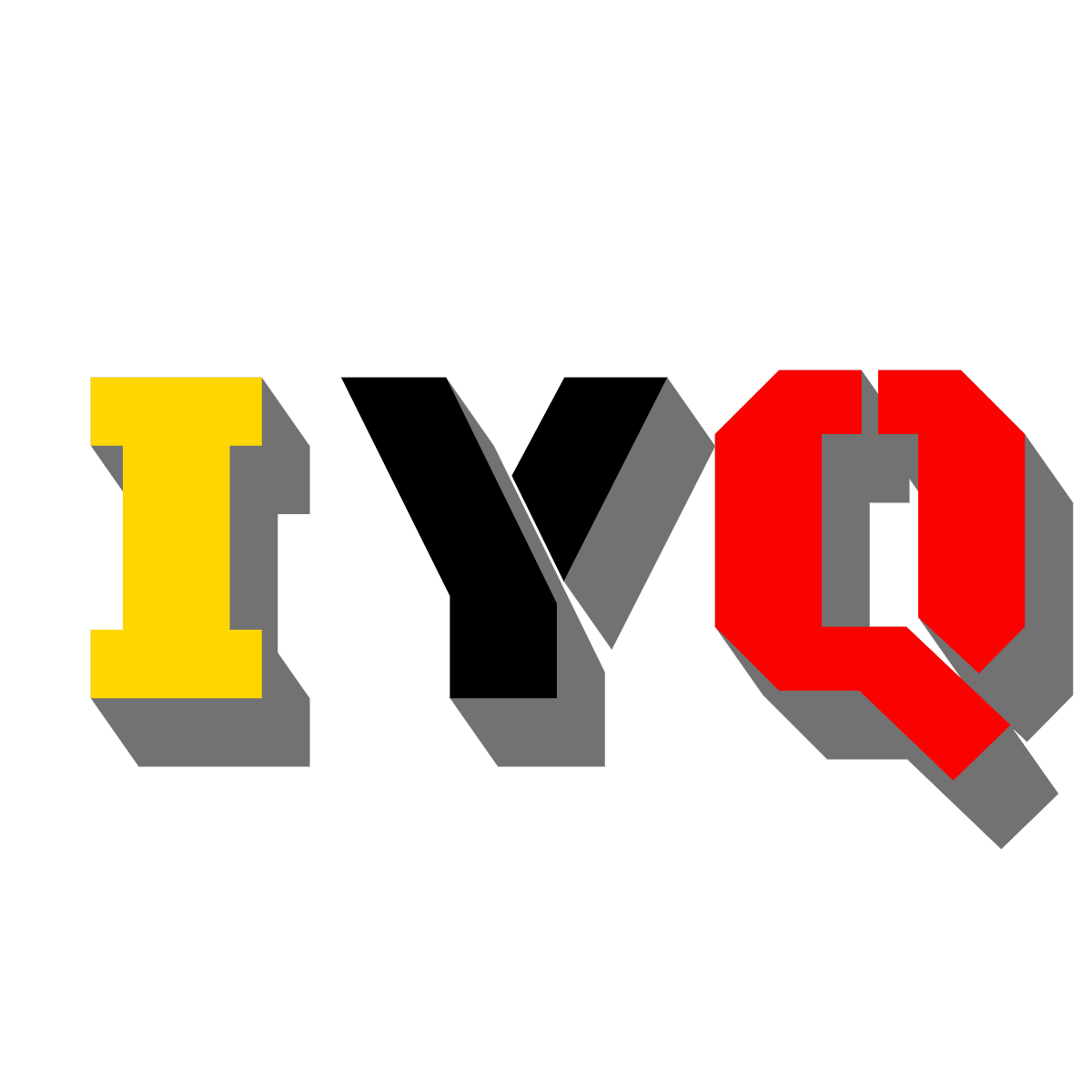
The I is gold, the Y is black, the Q is Red, the shirt is white (it will only be offered in white), and the shadow is green.

  • Gold – Heaven and God’s love (Revelation 21:18, John 3:16)
  • Black – Sin and separation from God (Romans 3:23, 6:23)
  • Red – Christ’s blood shed for sinners (Romans 5:8, 1 John 1:7)
  • White – Forgiveness and a clean heart (Psalm 51:7, Isaiah 1:18)
  • Green – Growing in faith (2 Peter 3:18, Colossians 1:10)

Inspired by the historic Wordless Book Gospel tool—colors that tell the greatest story ever told.

The color are from a simple yet profound evangelism tool to communicate the core message of the Gospel. It was first introduced by Charles Haddon Spurgeon on January 11, 1866, during a sermon at the Metropolitan Tabernacle in London. Spurgeon described three colors—black, red, and white—as symbolic of humanity’s sin, Christ’s atoning blood, and the cleansing of the believer’s soul, respectively (Spurgeon, Sermons, No. 3009).

Over time, this visual approach was embraced and expanded by Christian leaders and missionaries such as D. L. Moody, Fanny Crosby, and Amy Carmichael, who recognized its effectiveness in reaching both children and adults, especially across language and literacy barriers.

In 1939, the method gained wider use when Child Evangelism Fellowship (CEF) began printing Wordless Books and providing training on how to use them. CEF later added gold (heaven) and green (spiritual growth) to the original three colors, making a five-color version commonly used today.

Despite additions and format changes (bracelets, shirts, cards, flags, etc.), the core message of salvation through Jesus Christ has remained unchanged.


Sources:

  1. Spurgeon, C.H. (1866). The Wordless Book Sermon. Metropolitan Tabernacle Pulpit, Sermon No. 3009
  2. Child Evangelism Fellowship. (n.d.). Wordless Book Training Resources. www.cefonline.com
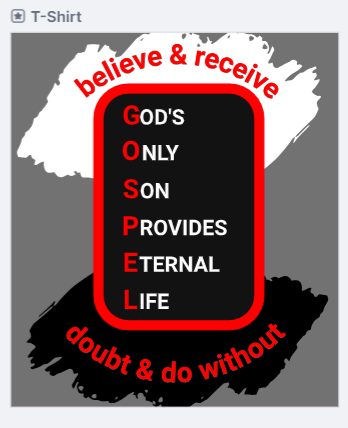
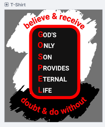
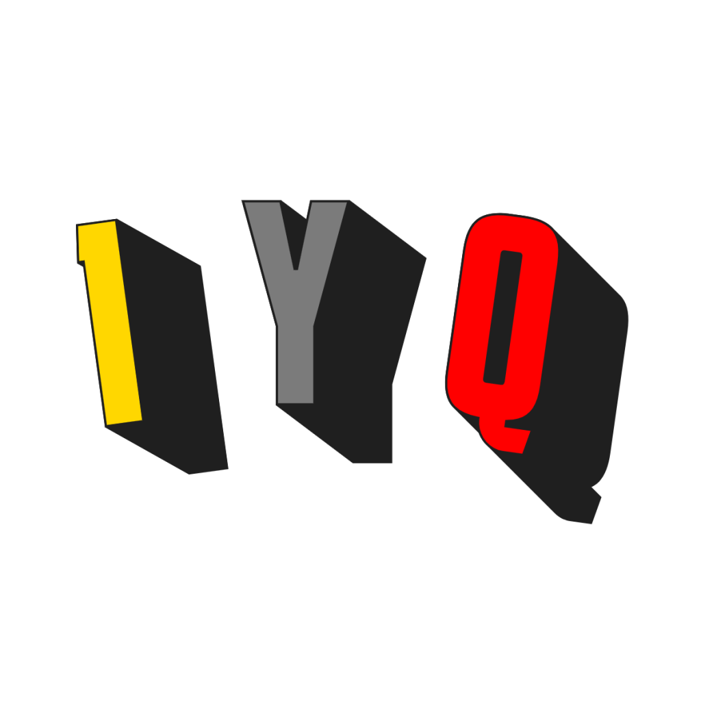
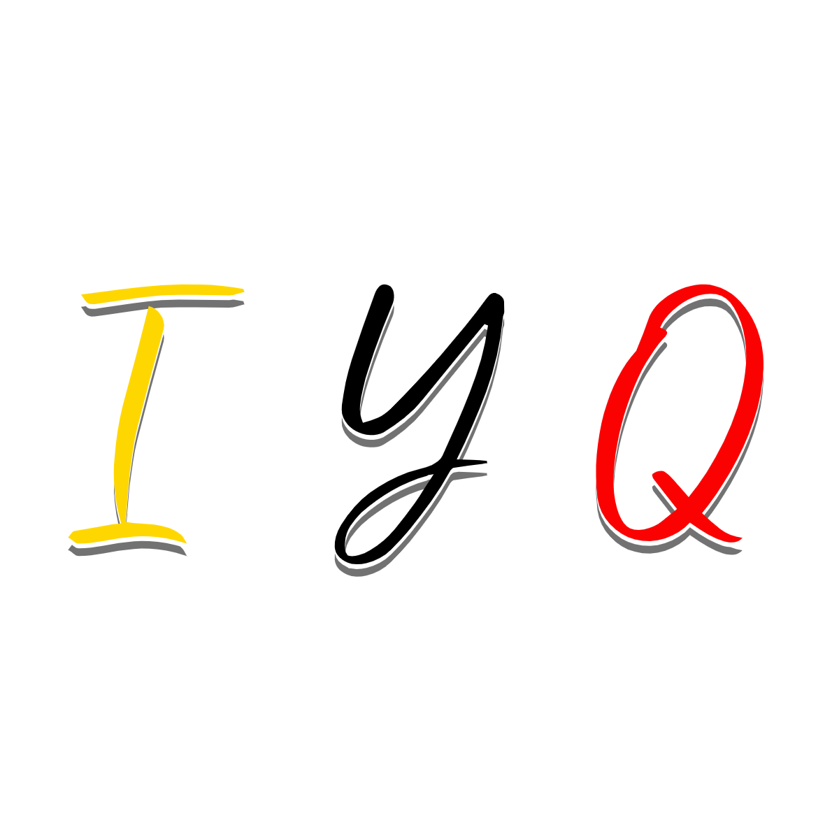
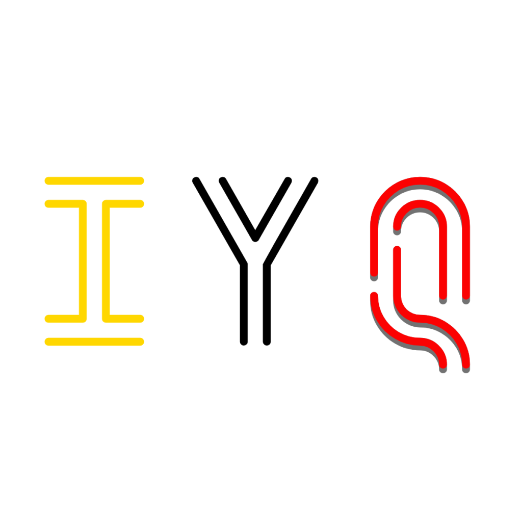
Design Choices

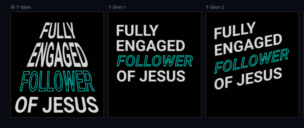
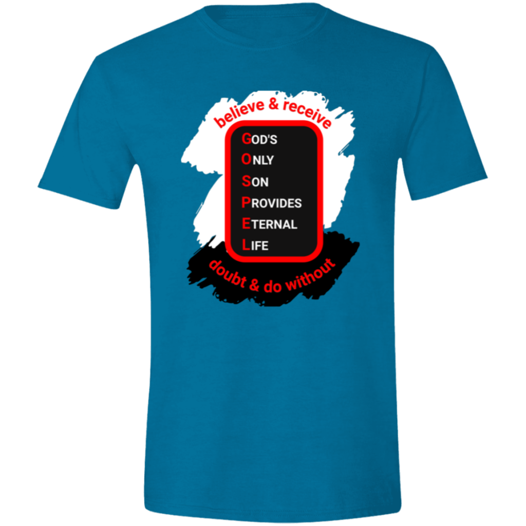
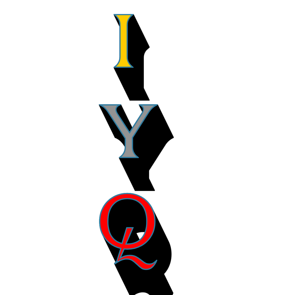
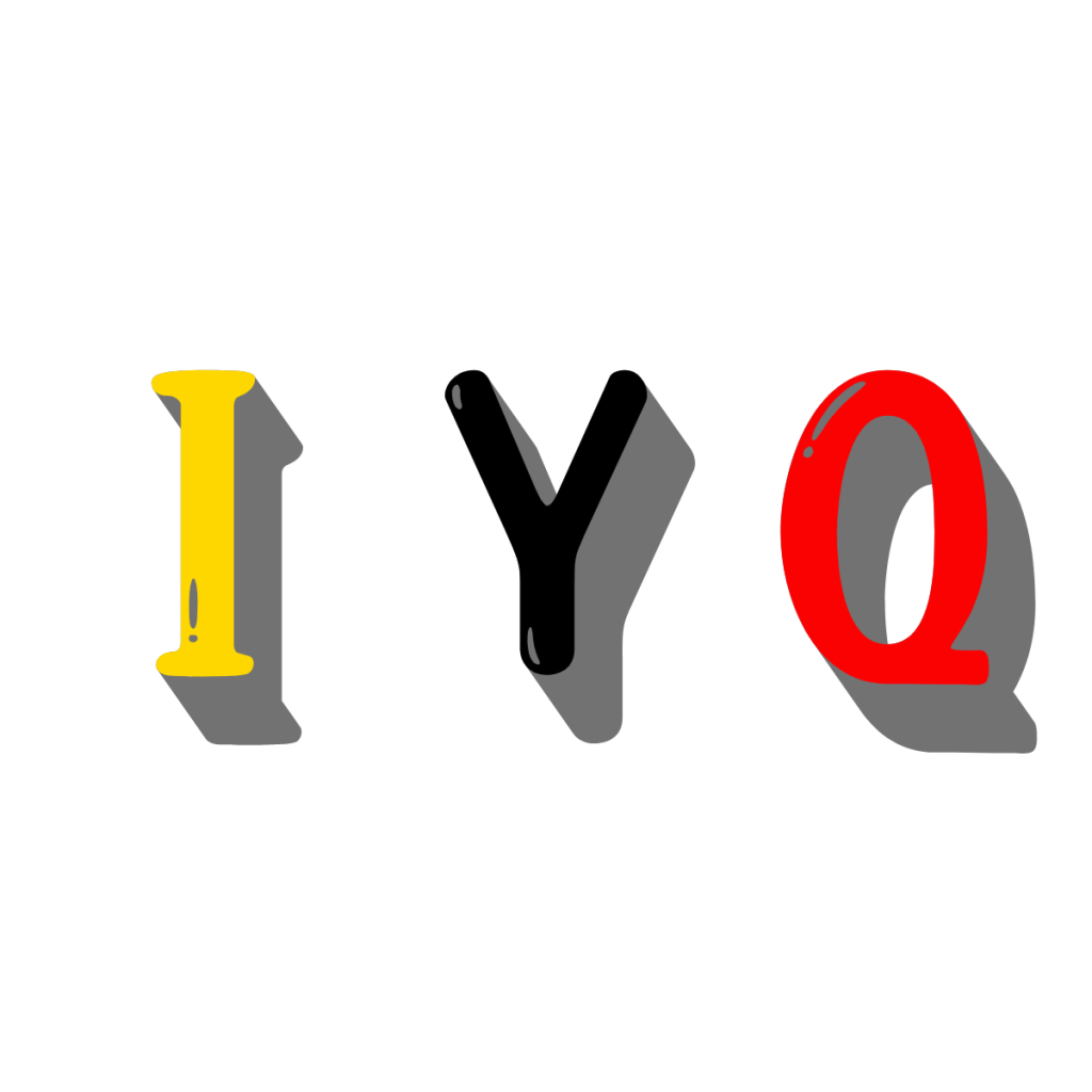
I sent Brother Ray a lot of choices on this design. It’s three letters so there were a lot of options. In the end, he choose the most readable one from a distance. It really pops out.

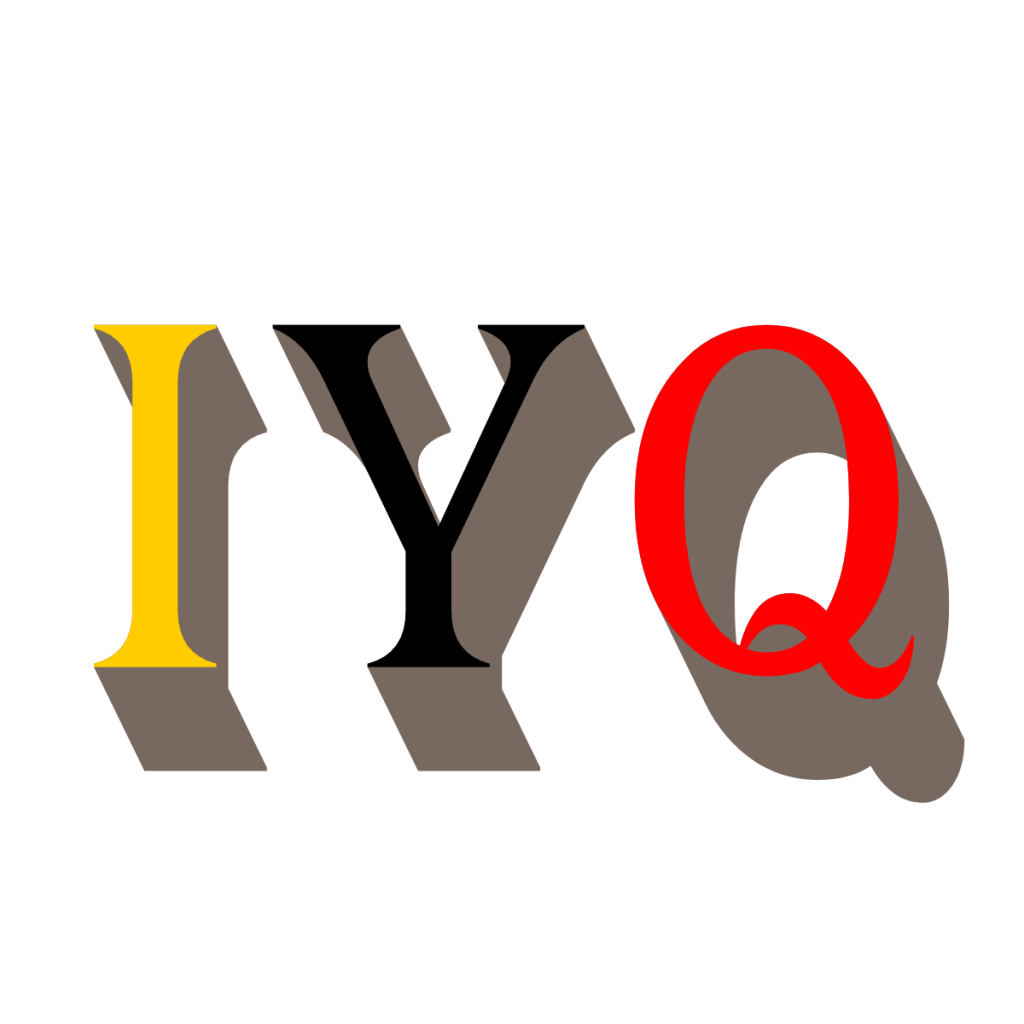
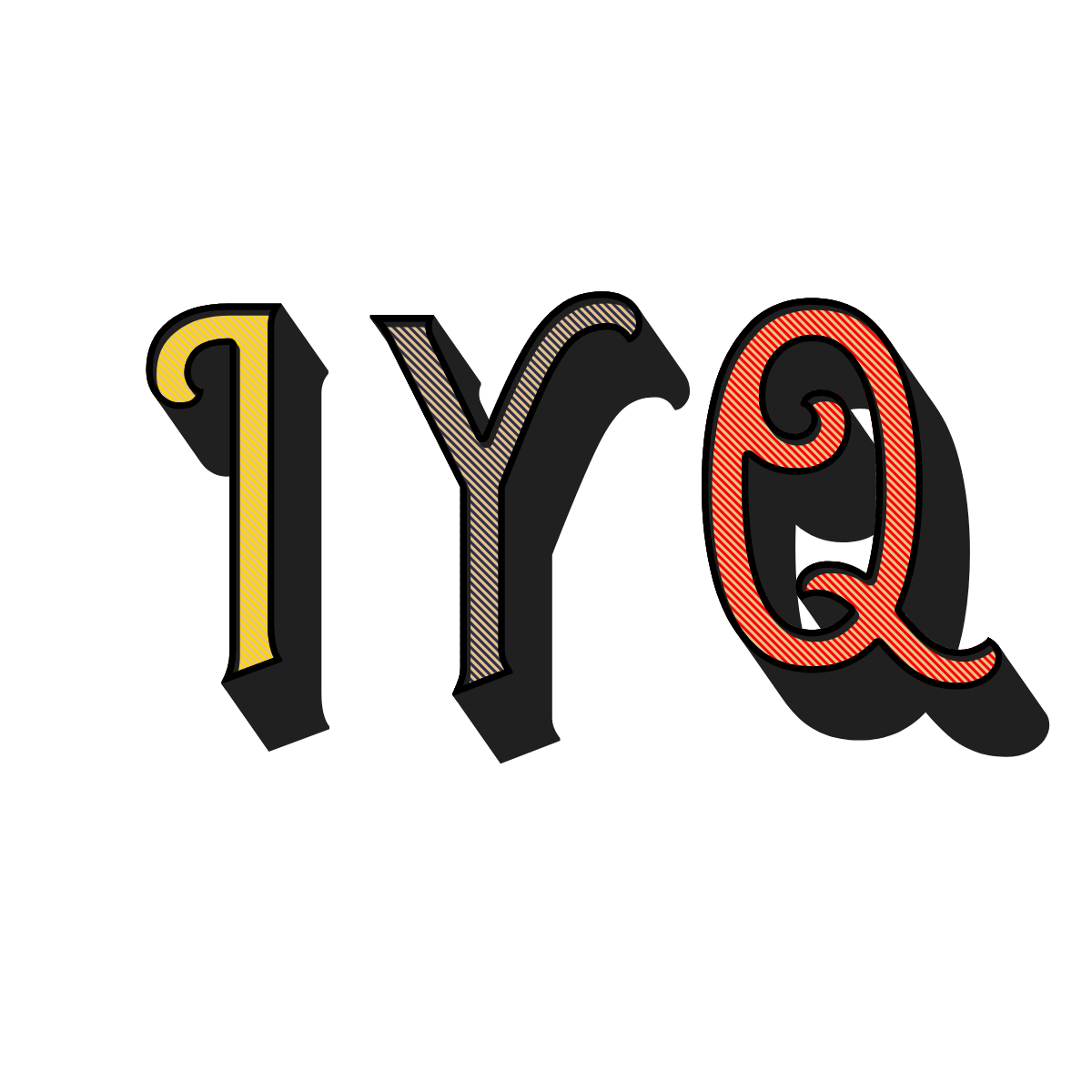
Here’s the design choices we passed back and forth. Initially, the focus was just on Gold, Black, and Red letters on a white shirt. The idea to add the green shadow came last. That’s why these don’t have a green shadow in them.

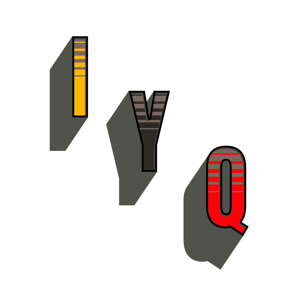
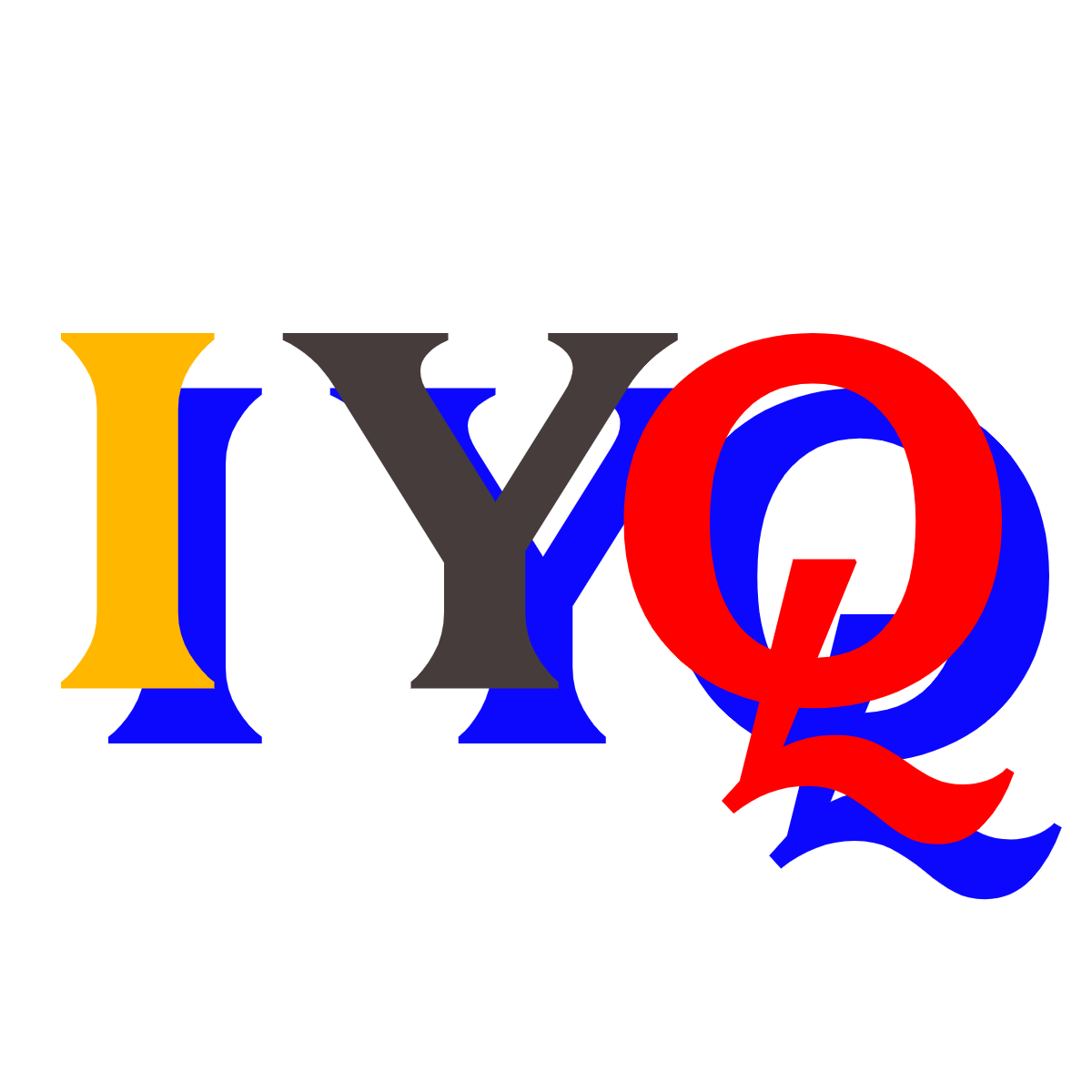
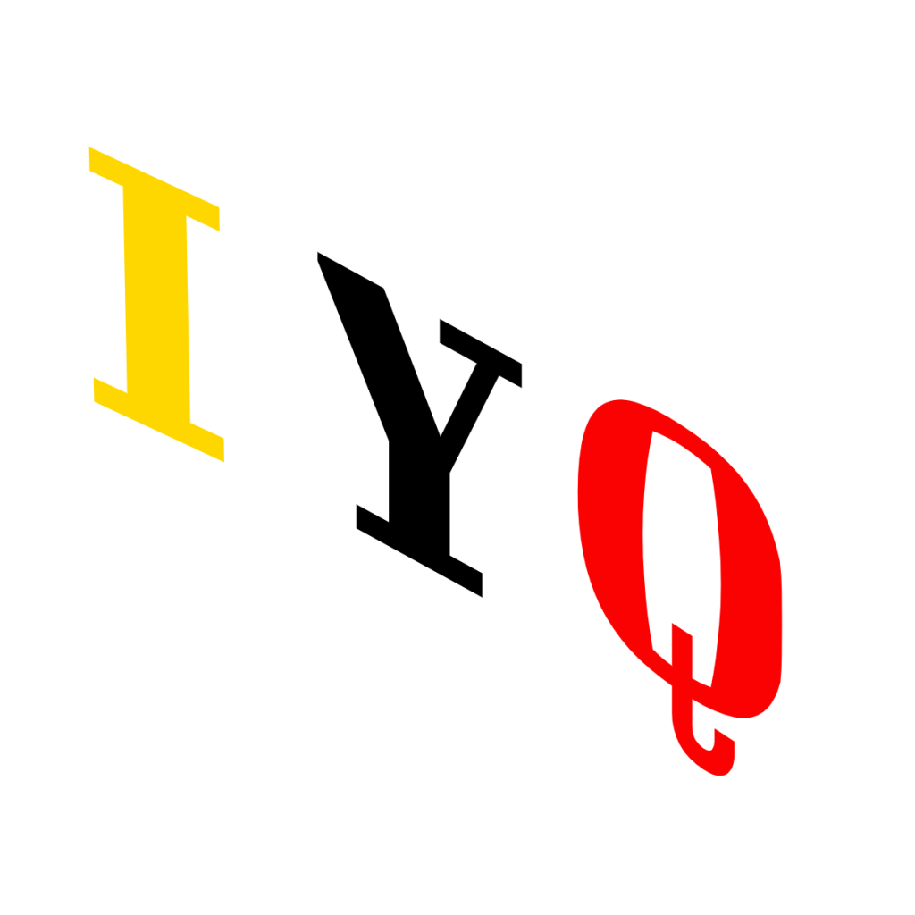
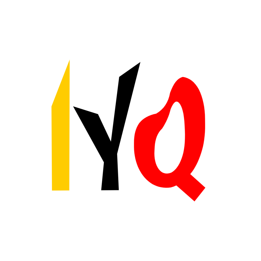
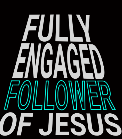
Brother Ray said he liked the 1st one the best, but with the shadow effect of the later one with a blue shadow. Except he wanted the shadow to be green. I sent him two green shadow options.

and

He said the lighter one was better.

The last thing we discussed was the placement of the letters on the shirt. As a fairly long, but short in height design, we could have moved them into a top, mid, or lower area of the shirt. When seeing the options, he choose the top location.

Thus, the shirts were created and up for sale now!

In fact, we’re created a whole category for Brother Ray’s shirt collection! https://patriotprayertees.com/product-category/brotherray/

Posted on

Brother Ray’s 4th shirt

The ideas keep flowing from Brother Ray! This graphic is from a business card he passed to people while ministering.

I wanted to keep this one as original as possible. I imported the image, removed the background & boarder. Then I used the Kittl app to covert it to a vector image. I deleted all the text and replaced with title text. I chose a font that resembled being hand lettered, as the bike seems to have taken that feel after being converted. Here’s the result.

I’ll send this over to him and see if he approves. If so, then we have 4 Brother Ray shirts! Thank you Brother Ray!

I’ll also send an alternate with the text more like stencils and less hand drawn.

After a a while, I heard back from Ray and he likes the slight changes, where the letters are less hand drawn looking.

Time to create the shirt listings with CustomCat and move them over to the website!

PPT

Posted on

Brother Ray’s 3rd Shirt

This one is a much shorter story than the last shirt. Only one post.

Brother Ray sent me this image of a shirt he had made many years ago.

Being three lines of text and two fonts and two colors, these are the variations I sent Brother Ray to review.

Basically the same design:

However, I added some variations. Here’s the first variation. I might have gone too far on this one. I angled all the text. Then I made the 1st two lines color cut (two tone) and I duplicated the 3rd line, changed the color, and put the duplication behind the original. Brother Ray didn’t like this.

The next variation removed some of those changes. I removed the two tones and duplicate background on the 3rd line. However, I kept the angle. He still wasn’t a fan.

Then I tried this approach. Like a pyramid. Brother Ray said we were getting better now. However, he wanted to add a 4th line, “of JESUS .”

Since I had the designs saved, I added “of Jesus” to all of them and sent one more time for a side by side vote.

He picked the one on the far left. However, I wasn’t finished. It might be hard to tell, but I took apart the image and created a pyramid to align the text to. Then once the text was completely aligned, I deleted the pyramid shape behind the text for this final product.

On this design, we’re not going to change the colors. It should look good on dark shirts, but not on light shirts.

I’ll start loading this one into the store now. That’s all for Brother Ray’s shirt #3.

Posted on

Brother Ray’s 2nd shirt – part 3

In parts 1 and 2, we ironed out (please don’t iron our shirts, btw) the optical illusion part of the shirt. Now for the shirt message.

Staying close to Brother Ray’s image of his design we have option 1:

I get the general idea, as you read the 3rd line, you start to turn your head and possibly see the face spells ‘Liar’. But, I wanted to give Brother ray some more options, so I proposed these three additional options:

Each has you turning your head a bit to read them, so the effect is the same as the original. After seeing them all, Brother Ray decided on the 1st alternate option, where the words sort of form the person’s back. It adds to the face illusion.

Now we’re down to color choices. The original shirt was all black text on a grey shirt. We agreed keeping all the text the same color was best. However, We expanded the color choices a wee bit. Here’s a start of the color choices for the text on some representative backgrounds. However, each will be placed on the t-shirt color that works best with that text color.

The next step is to create the shirts, but that will have to wait for another day.

All shirt listing will have “Artwork inspired by “Liar Face” illusion by Paul Agule.”

Posted on

Brother Ray’s 2nd shirt – part 2

With the image direction squared away there were still design considerations to make.

What does the replacement ‘liar face’ look like? What would a derivative or inspired by work look like?

Here are some that we considered. I would create them, share with Brother Ray and others for input, consider all the feedback, revise the design, and repeat. To date, this shirt design has seen the most revisions and collaboration. We really burned the midnight oil and racked up many texts and messages.

Honorable mention; use the word “thief”. It might have worked given enough trial and error. But at the onset, it doesn’t look like a face.

Next up, the word “lies” instead of “liar”. This one seemed like it was getting close, depending on the font used.

I certainly see a creepy face in this, but we didn’t like the “i”, not exactly part of the nose.

Then we tried “lies” again with more of a like shaking hand writing. It was manipulating each letter of the font to get this effect. This time we liked the nose area, but not the mouth or chin.

Then we took a completely different approach. What about using words to made up the lines of the letters, which also make up the face?

We tried the words from the Scripture referenced on Brother Ray’s shirt, which is John 8:44. This one had promise. From a distance, you still get the word “Liar” in cursive and a face. When you get closer you can see the word of the verse. It’s a solid runner up design.

We tried one more and this is the one Brother Ray liked the best. It’s not the words of the verse, rather it’s different types of sin – which almost all involve lies to others or to yourself. Additionally, the use of words not connected in a sentence allowed for variations in text size, direction, and distortions to really follow more of a cursive “Liar” from a distance.

Once again, this work is inspired by the classic, but it is certainly not the same work.

Posted on

Brother Ray’s 2nd Shirt – part 1

Brother Ray sent me another project — a “LIAR” tee he purchased 30 years ago from a local printer.

As with other designs from Brother Ray, I jumped right in and started recreating versions based on the photo he sent. However, something about this one felt familiar. That’s where the story gets a bit tricky.

At PPT, we’re very careful not to step on any toes when it comes to using other people’s artwork without permission. Here’s what I found about the image in question. Part 2 will cover the alternatives we came up with, but first, we need to clear up the background.

Let me be clear: this post is not meant to suggest there was anything wrong with how Brother Ray’s shirt was made locally back in the day. It’s possible the image was released into the public domain, or, given that this was pre-internet, maybe the printer bought rights to use a stencil or design. Either way, it’s highly likely there’s nothing controversial about the original shirt’s production — 30 years ago or more. Many I’ve spoken with recall seeing this design on t-shirts or in books around the late 80’s and early 90’s.

Still, PPT wants to be extra cautious. So we decided to create a design inspired by the original image, rather than using it outright.

Now, back to the image — part of the “LIAR” tee looked very familiar. In fact, it went viral on TikTok in 2022. That TikTok post (which doesn’t credit the artist, but also didn’t use the exact same image) racked up over 1.5 million views and can be viewed here:
https://nypost.com/web-stories/spot-the-hidden-word-in-this-optical-illusion/

Fortunately, the New York Post’s article about the TikTok trend did credit the original creator:
https://nypost.com/2022/09/20/facial-recognition-spot-the-hidden-word-in-this-optical-illusion/

According to the article:

“Originally created by New York artist Paul Agule in 1987, the image is an ambigram, a type of optical illusion that depicts more than what initially meets the eye.”

We also found the image listed again, titled “Liar Illusion”, with credit to Paul Agule at anopticalillusion.com.

With his name in hand, I did one more search at the U.S. Copyright Office’s online public catalog (which is scheduled to be replaced soon, so this link may not work for long):
https://cocatalog.loc.gov/cgi-bin/Pwebrecon.cgi?v1=2&ti=1,2&Search_Arg=Agule&Search_Code=FT%2A&CNT=25&PID=Q5IW3TNtEFGyQ3Y7LCQzRvYpyGSbO&SEQ=20250531225910&SID=2

Sadly, additional searching revealed that Mr. Agule has passed away. Source:
https://www.hartisland.net/burial_records/paul-agule

I hope this post helps others using the graphic to give proper credit. I found many sites featuring the image without attribution, which feels wrong considering the impact and creativity behind it.

As for using the image today, options seem limited. One possibility would be to try contacting Mr. Agule’s estate to inquire about the rights. But as I mentioned earlier, I don’t know what licensing agreements — if any — were made with printers or publishers 30 years ago.

The better path for us, and the one we’ve chosen, is to create a new design inspired by Mr. Agule’s famous “Liar” face — and to give him the attribution he deserves.

Posted on

New design brewing – part 2

Recap from part 1: Yes, I know, “Faith is obedience” leaves a lot out of the picture. What are some other ideas that would work?

🔥Group 1 – Bold & Simple:

  • “Faith Obeys.”
  • “Faith is Obedience.” (The original phrasing—short, strong, makes people think – but not enough explaination)
  • “To Believe Is to Obey.”
  • “No Obedience, No Faith.”

✝️ Group 1 – With Scripture Hints:

  • “By Faith, Noah Built.” – Hebrews 11
  • “Faith That Sits Still Isn’t Real.” – James 2
  • “Obedient Faith – Romans 1:5” (Paul talks about the “obedience of faith” there)

🛣️ Group 3 – With a Visual/Metaphor of a car:

  • “If You Trust the Car, You Drive It. Faith Moves.”
  • “Faith Doesn’t Just Sit in the Driveway.”
  • “Trust = Action. Belief Drives Behavior.”

Overall, I’m leaning towards:

“To Believe Is to Obey.” ✦

Tone: Reflective

Theological weight: Emphasizes the unity of faith and action without sounding harsh. It invites thought—kind of a modern echo of Hebrews 11 and Romans 1:5 (“obedience of faith”).

However, does that put me back into the “Faith is obedience” foot in the mouth that started this whole thing?

I may consider:

“Faith That Sits Still Isn’t Real.” – James 2

as a 2nd choice.

Posted on

New design brewing

“Faith is obedience”, I made this comment and it seemed to get a lot of views in 2 days:

Now, before you stop reading – I don’t believe in works based salvation, that’s not what I was trying to say.

Now for those especially rooted in the doctrines of grace, biblical authority, and the distinction between faith and works, the statement “faith is obedience” may be a bit oversimplified. Here’s some thoughts on the topic.

True faith results in obedience:

  • Faith produces obedience, but it is not the same as obedience.
  • James 2:17 — “ Even so faith, if it hath not works, is dead, being alone.” KJV
  • John 14:15 — “If ye love me, keep my commandments.” KJV
  • Ephesians 2:8-10 — Yes, I know people like to quote verses 8 and sometimes 9, but keep going to verse 10.
    • For by grace are ye saved through faith; and that not of yourselves: it is the gift of God:
    • Not of works, lest any man should boast.
    • 10 For we are his workmanship, created in Christ Jesus unto good works, which God hath before ordained that we should walk in them.” KJV
  • We are saved by grace through faith, but we are saved unto good works (we should walk in them, be doing them).

Obedience is evidence of saving faith:

  • A person who truly believes in Christ will be transformed and will walk in obedience to God’s Word.
  • Obedience follows faith as the fruit follows the root.

Faith itself is a response to God:

  • In that sense, believing God is obeying His call to trust in Christ (Romans 10:16 — “But they have not all obeyed the gospel…”).

Now, I understand, if “faith is obedience” implies that faith = doing good works or obeying commandments, that would blur the gospel and resemble legalism. I may have been hasty in posting. In Romans 4:5 — “ But to him that worketh not, but believeth on him that justifieth the ungodly, his faith is counted for righteousness.” KJV. Faith is often described as the empty hand that receives the gift of grace—not a meritorious act.

Are these some better phrases?

“True faith obeys.”
Or: “Faith is the root, obedience is the fruit.”
Or: “Obedience flows from faith, but faith is not identical to obedience.”

What I was trying to describe faith not as mere intellectual agreement, but as a trusting action—a commitment that manifests in what you actually do. And that is Biblical:

Jesus said in John 3:36 (ESV): “Whoever believes in the Son has eternal life; whoever does not obey the Son shall not see life…”

To compare, John 3:36 (KJV) “He that believeth on the Son hath everlasting life: and he that believeth not the Son shall not see life…”

Another comparison, John 3:36 from the Amplified: “ He who believes and trusts in the Son and accepts Him [as Savior] has eternal life [that is, already possesses it]; but he who does not believe the Son and chooses to reject Him, [disobeying Him and denying Him as Savior] will not see [eternal] life,”

Belief and obedience are intertwined.

Hebrews 11 shows that faith always moves people to action:

“By faith Noah… prepared an ark…”
“By faith Abraham… obeyed…”
“By faith Moses… refused to be called the son of Pharaoh’s daughter…”
Faith doesn’t sit still—it acts in obedience.

As mentioned, I want to be very cautious about collapsing faith and obedience into the same category because:

  • Faith is how we’re justified (Romans 5:1: “Being justified by faith…”).
  • Obedience is the result of justification, not the cause (Titus 3:5).

So by saying “faith is obedience”, some may think I’m implying faith = works, which I wasn’t trying to say. But, I didn’t explain any further either.

Last thoughts.

Here are some ways to preserve the original simple post I made while staying in bounds theologically:

  1. “Faith is obedient trust.”
    • This fits well with Hebrews 11.
  2. “Faith is not faith unless it obeys.”
    • This echoes James 2.
  3. “Faith and obedience are two sides of the same coin.” (I’ve heard this before, just not sure where.)
    • The trust is the obedience in that specific action, without being reducible to law-keeping.
  4. “To have faith in Christ is to obey His command to believe.”
    • See Acts 17:30 — “God commands all men everywhere to repent.”

I’ll think on the idea for a design next.

Posted on

Brother Ray Story – Part 3

At the end of part 2 we had a sharp looking shirt, but I didn’t like the overall balance. Over the next couple of days I kicked around some designs. Two things I noticed while working on the overall layout was that GODS needed to the GOD’s and the lettering was not a match for the original patch.

In the original patch, the letters in GOSPEL are larger than the other letters.

But in the last design, all the letters were the same size.

So, it took a bit (ok a lot) in Kittl to get it looking good and lined up, but eventually I got it like this, which looks much closer to the original.

After several options for where to place the extra words Ray asked for I send this design to Ray:

I like it, but I still felt it wasn’t as balanced as it could be. Maybe I’m not using the right word, but it still didn’t look complete yet.

I duplicated the white patch, inverted it, and placed it behind the patch. That was it. That was the missing piece!

Ray said, “I love it & think it might make U good seller.”

I said, “it’s your design, I don’t want to sell it – that wasn’t the point” It was supposed to be more like a birthday present for him.

Ray said, “I want the message being seen. SELL it!”

That’s how we now have this design for sale in 4 types of shirts.

https://patriotprayertees.com/product-tag/gospel