Posted on

Brother Ray Story Part 2

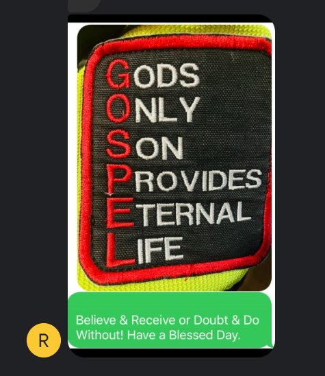
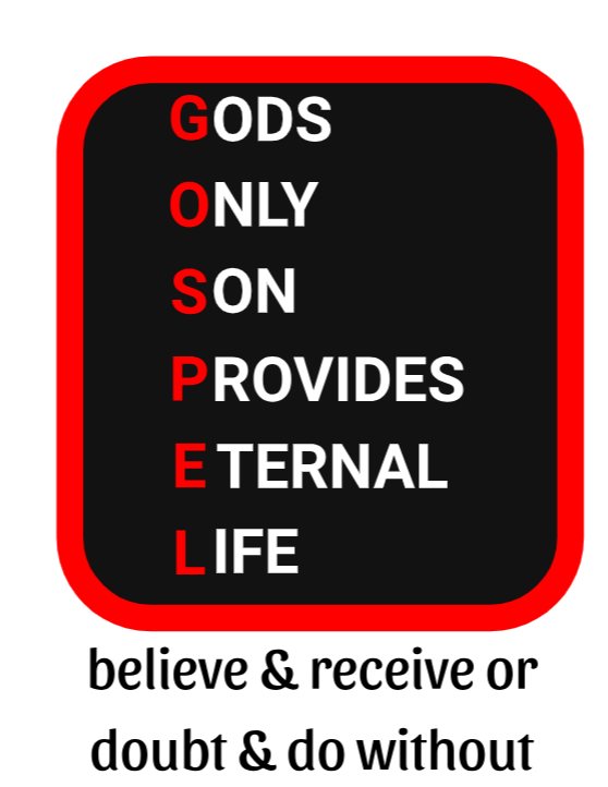
This is more of the story. I thought the next steps were to clean up the lettering, but Brother Ray had a different idea.

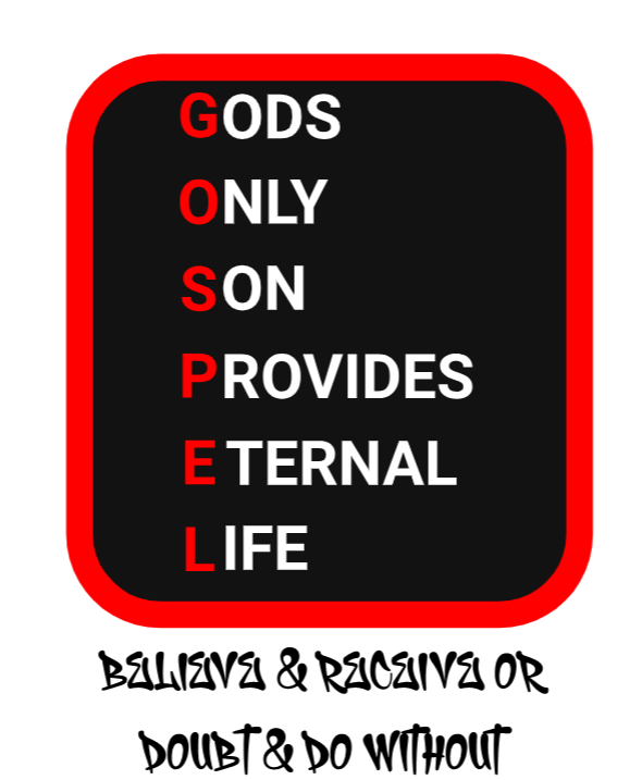
In reaction to the 1st design he said, “WOW! I would put the believe & receive or doubt & do without under it.”

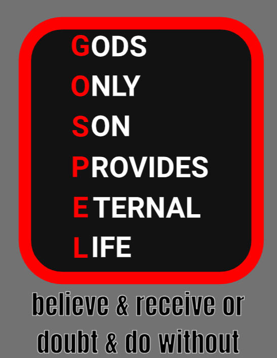
Then we started going back and forth. I sent:

He said, “No way, is my opinion. Difficult to read at a glance. For me the clearer the better.”

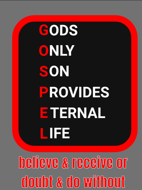
Then I sent this version:

He said: “More like that.”

Then I starting thinking of how those small letters would be against different colors, so I added a white outline.

Ray said, “This is not ez at all glance.”

Then I tried:

He didn’t like that either.

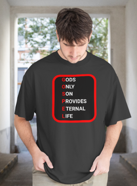
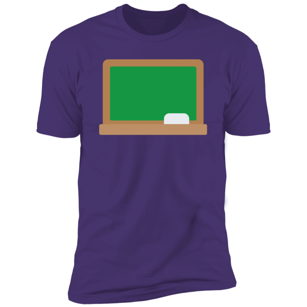
So, I thought what I need to control how that text presents is a shape behind it. After some more back and forth, we came up to this design:

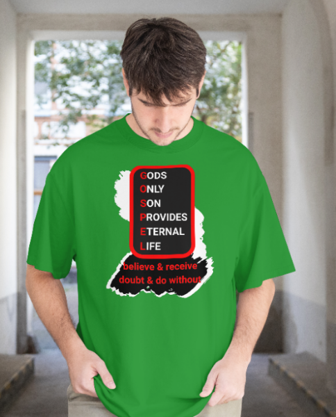
Now the background (shirt) color is more flexible.

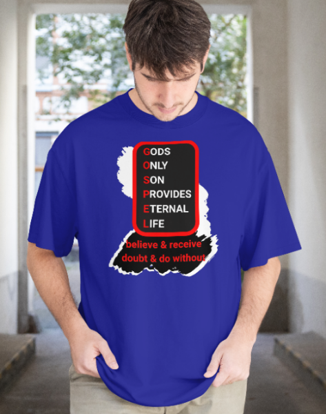
Ray said, “Now we R cooking with gas.”

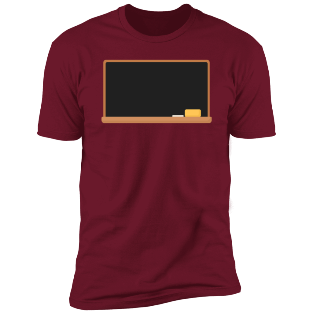
I also send him a mock up on red. Red might be the exception, doesn’t do well with red shirt or pink. Ray agreed.

While Ray was happy, I didn’t like the overall shape, or the balance. I’m not a graphic designer. Everything is coming from high school art class, which was before the 2000. Let’s just say that. It was a long time ago. Since, I’ve read some articles on design and art, but still drawing a lot from high school for these shirts. Anyway, the flow or balance, whatever it is called, didn’t sit well with me. So, this isn’t the end of the story or the shirt.

I’m off to a birthday party, so the rest of the story will have to wait until very late today or tomorrow.

Posted on

Brother Ray Story – Part 1

This is a story leading up to a new shirt. Brother Ray and his wife are bold and outgoing witnesses for Christ.

He texted me a clothing patch for leather jackets and vests he’s been handing out at motorcycle ministry events for may decades.

I said something like, wow that would make a nice t-shirt!

He said, “I designed that N 1991. It would make a great Tee.”

After some more back and forth, I told him I had to go to work (this was all before 8AM one day).

Later that day, I get home from work, have dinner and send him a quick mock up (I really didn’t like how the letters linked up in this version). My 1st offer to him was to send him and his wife copies of the shirt without listing them for sale.

That’s the 1st part of the story.

Posted on

Re-markable Shirt Idea

[Update: We tried it with three shirts and Chalky Crown markers and it didn’t wash out enough.]

How about a shirt that is more like a whiteboard and people write a new message after every wash? How about using the DIGISOFT®’s smooth slick surface for a large writing area. Then include a package of pens from either: Chalk Ink, Crafty Croc, and Marvy Uchida Bistro chalk markers.

Has anyone seen this done before? I hope I’m not copying from someone else, but the idea seems familiar from say the 1990s.

Here’s a mock up as it would be ordered:

Here’s a message written on the shirt, again a mock up:

Here’s one brand of the pens needed:

Open to feedback and ideas!

Thanks!

-PPTs

Update 6/6/2025

We’re going to give this a try. Here’s the shirts I made and ordered as well as ordering the markers from above. Stay tuned for the results. I plan to use put this through several uses and washes.